How to Do Vertical Video Editing That Holds Viewers in 2026
Learn vertical video editing step by step: 9:16 export specs, safe zones, hooks in the first seconds, captions and when to adapt one edit per platform.

On this page
Your phone gallery holds 40 clips from a shoot that took two hours, and the export finished at 11pm. You cut the interview down to 42 seconds, dropped it into a 9:16 sequence, nudged the subject toward the middle and posted. By morning it had 1,340 views and no comments, while a competitor's clip of someone talking into a phone camera with the top of their head cropped off had 90,000. Their footage wasn't better. Their edit was built for the screen it played on, and yours was a horizontal cut wearing a vertical frame.
That gap is the whole discipline. Vertical video editing is not resizing at the end of the process. It's a different set of decisions about canvas, crop, caption placement, opening frame and pacing, made in a different order, and some of the work it adds isn't worth doing at all. This is the version I'd hand to someone cutting short-form clips every week.
- U.S. adults who mainly watch short-form video vertically on a smartphone
- 81%
- Media.net survey, 2025
- U.S. adults who name YouTube Shorts their most-used short-form platform
- 56%
- Media.net, November 2025
- Standard pixel size of a full-screen 9:16 vertical canvas
- 1080 x 1920
- Sprout Social specs guide
- Space to keep clear above the bottom edge for captions and interface
- 280-320 px
- Sprout Social specs guide
Vertical Video Specs and Safe Zones to Set First
Set the canvas to 1080 x 1920 px at 9:16, and match the sequence frame rate to the footage, before anything lands on the timeline. Those two choices decide how much rework follows, because every later decision (how far a push-in can travel, how large a caption reads, whether a face survives the crop) is measured against them.
| Setting | Value | Why it matters |
|---|---|---|
| Canvas size | 1080 x 1920 px (9:16) | Standard full-screen size for vertical feeds |
| Container and codecs | MP4, H.264 video, AAC audio | Broad platform compatibility with predictable file size |
| Frame rate | Match the source, usually 24 or 30 fps | Converting to 60 fps adds encoding cost without real motion detail for talking-head clips |
| Bitrate at 24-30 fps | About 8 Mbps for 1080p | Balances upload size against platform recompression |
| Bitrate at 48-60 fps | About 12 Mbps for 1080p | Preserves motion in high-frame-rate footage |
| Top safe zone | Keep about 150 px clear | Search and navigation elements sit here |
| Right safe zone | Keep about 120 px clear | Interaction controls sit here |
| Bottom safe zone | Keep 280-320 px clear | Captions, handles and system UI compete for this space |
The 9:16 canvas isn't a style trend. In a 2025 survey of more than 1,000 U.S. adults, 81% told Media.net's short-form video study that they primarily watch short-form video vertically on a smartphone. Edit for the default viewing condition and the horizontal version becomes the optional extra.
The export values in that table follow the social media video specs guide from Sprout Social, which recommends MP4 with H.264 video and AAC audio, about 8 Mbps for 1080p at 24 to 30 fps, roughly 12 Mbps at 48 to 60 fps, and reserves about 150 px at the top, 120 px on the right and 280 to 320 px above the bottom edge for interface elements. Cheaper bitrates survive a text-heavy frame badly once the platform recompresses it.
Where the interface eats your frame
The most common production failure isn't a bad crop. It's a technically correct 9:16 export with the subject's eyes under the search bar or the punchline hidden behind the caption and the interaction buttons. The file plays fine and the video still fails, because the viewer never sees the part that mattered.
Practical rule: if a face or a word sits inside an unsafe band, move it before you export. Fixing it afterwards costs a re-upload and a second attempt at the same audience.
Draw the three boundaries as guides in the project, then walk each shot and push anything inside them back toward the middle. If you're still converting horizontal masters after the fact, this breakdown of vertical video aspect ratio explains why cropping a 16:9 frame rarely matches footage shot and framed for the tall screen.
How to Edit a Vertical Video Step by Step
Work in this order and you'll avoid the loop where reframing breaks your captions and recutting breaks your reframes.
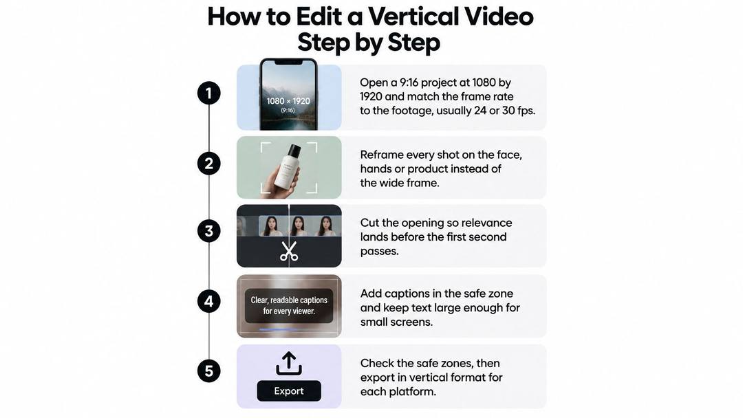
The order that avoids rework
- Open the project at 1080 by 1920 and match the frame rate. The usual slip is cutting on a 16:9 timeline and cropping at export, which throws away every composition decision you already made.
- Reframe every shot on the face, hands or product. Centering a wide clip in the portrait canvas cuts eyes or product edges. Keyframe a slow reposition instead of zooming the whole clip and losing resolution.
- Cut the opening first. Put the strongest visual or line at frame one and push the context behind it. If you build the middle first, the opening ends up as whatever footage is left over.
- Delete pauses longer than a beat. Every cut should move the story forward. Cutting to a music grid rather than to the voice is the slip here, and it produces edits that feel busy and say nothing.
- Add only motion that clarifies. A short push-in on a result, or a cut on action so the movement continues across the join. Trend transitions go at the end of the process, if they survive at all.
- Keep text inside the guides, then scrub the auto-crop. Auto-reframing follows a face but doesn't know that the product label matters, so check both ends of every clip.
- Build captions after the picture is locked. Text timed to clips you later delete means retiming the whole track.
- Play it once muted. If the point disappears without audio, fix the pictures and the text before you touch the export settings.
- Export with the container, codec and bitrate from the specs table, then check the uploaded file on a phone. Platform compression softens small type, and the local export always looks sharper than the published version.
The finished frame should read at a glance, with the subject large enough to recognize on a five-inch screen and every word of text sitting above the lower control band.
Two more habits pay off. Lock the audio edit before you refine visuals, because changing a line means re-timing captions and re-trimming shots. And export a draft early, watch it on the actual phone you carry, then go back and fix the three things that annoyed you. That preview catches more than another hour of scrubbing on a desktop monitor.
Design and Test the Opening Before Viewers Leave
A garlic-press review can open on the reviewer saying the handle broke, or on a close-up of the bent handle. Both frames introduce the same problem, but they make different promises. Test the opening as a measurable experiment: keep the footage, audio, length and captions constant, then change only the first frame.
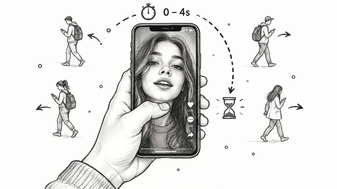
Short-form feeds give viewers little reason to wait through a slow setup. A flashy transition may catch the eye once, but a clear opening gives you a stronger test: does the subject or promise earn another second of attention?
Prompt to try
Make a 30-second vertical product review of a garlic press that opens on a close-up of the bent handle with the line "It broke on day three." Show the failure first, then explain why in quick cuts with bold two-line captions. End with a one-line verdict.
Change one variable at a time
For the garlic-press example, Version A opens on the reviewer saying the press broke on day three. Version B opens on the bent handle. Post both to the same platform under comparable conditions, then compare the three-second hold rather than total views. If the opening changes alongside the music, length and caption style, the result is hard to interpret.
Other useful tests include moving the payoff ahead of the setup, or comparing a caption-led opening with a spoken one. Change one element per round so you can connect the result to an edit decision.
| Checkpoint | What it tells you | Edit to test |
|---|---|---|
| 1 second | Whether the first frame stops the scroll | Swap in an alternate first frame, such as a face, product or text-led shot |
| 3 seconds | Whether the setup earns more attention | Reorder context and payoff so the result appears earlier |
| 5 seconds | Whether the topic holds past the opening | Test a caption-led opening against a face-led one |
| Average watch time | Whether the rest of the video sustains interest | Tighten cuts and shorten the setup before the first payoff |
Set a stopping rule before posting, such as a fixed number of posts or a calendar date. Otherwise, it is easy to keep making variants without reaching a useful conclusion. Label each export with the variable it tests, so you can identify the face-led version later.
Keep variants inexpensive to produce. Revid's timeline editor lets you change a line, swap a scene, restyle captions or regenerate one shot without starting over. Its publishing queue can post or schedule videos to TikTok, Instagram and YouTube, which helps when you are comparing versions across platforms.
For a visual reference on framing and export decisions, the walkthrough below covers the same ground.
When the test ends, use the stronger opening as a starting point for the next video and note what the weaker version did differently. Keep the log brief. A clear record of the tested variable and result is more useful than a growing folder of unlabeled exports.
Captions and Text That Hold Up on Small Screens
Captions are an attention and accessibility layer, not decoration applied at the end. A controlled eye-tracking study of 211 participants watching TikTok content found that two-line subtitles produced greater visual attention, longer total fixation time, more revisits, a lower skipping probability and a longer time to first fixation than one-line subtitles, as reported in this study on subtitle design in short-form video.
The caption method, in order
- Transcribe the speech first. Auto-transcription is fine as a starting point, but correct names and numbers by hand.
- Split into short semantic units, two lines maximum. A full sentence in a block gets skimmed; a phrase gets read.
- Emphasize one or two keywords per beat with color or weight. Bold every word and nothing stands out.
- Time each caption slightly before the spoken phrase and hold it through the utterance. Captions that lag make viewers re-check the screen.
- Keep the block in the lower safe area, above the band where the controls and account name sit, sized so it reads on a phone without squinting.
- Don't animate faster than reading speed. Word-by-word motion that outruns the voice is cognitive noise, not energy.
- Play the video muted and check the story still lands. If it doesn't, the pictures are carrying too little.
Measure the caption style instead of assuming
If a precise completion-rate lift gets attributed to animated captions, check whether it traces to a documented experiment before you rebuild your workflow around it. Set your own test: two caption treatments, same clip, compared on three-second hold, average watch time, completion rate and rewatches.
Two-line, keyword-weighted captions are the safe default. Your own numbers replace that default only when they beat it clearly across more than one post.
Keep the styling consistent across a series, because a viewer who learns where your captions sit stops hunting for them.
When to Publish One Edit or Split It Per Platform
A single vertical edit can work across platforms when its hook, framing, captions and ending fit each feed. Split it only when a specific change is likely to improve how viewers respond. A 2025 analysis of more than 5.6 million videos found TikTok reach fell 47% while engagement rose 36%, Instagram Reels views fell 59%, and YouTube Shorts publishing increased 61% while engagement declined 36%, according to Marketing Tech News coverage of Metricool's 2025 State of Short-Form Video report. More uploads did not automatically mean more engagement.
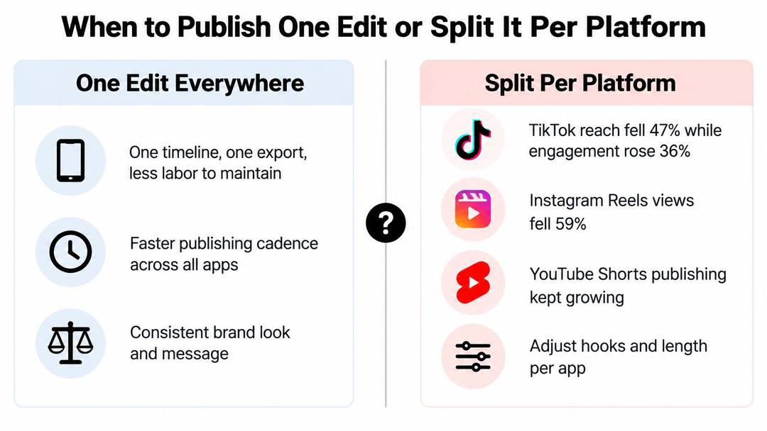
More publishing can mean more competition for attention, not a reason to produce a separate cut for every feed. Treat the opening as a measurable experiment: test a changed hook against the master, then compare the results before committing time to more versions.
What a platform version actually changes
A useful platform version changes something viewers will notice: the opening seconds, cut density, caption placement, call to action or end card. Resizing the same master file does not create a meaningful test.
| Source edit | Publish one master when | Split into platform versions when |
|---|---|---|
| Talking-head clip | The hook works in the first two seconds on each feed | The opening, captions or ending needs a different call to action |
| Product demo or ad | The product is visible at the start on each platform | The opening frame or price point needs to change |
| Tutorial with on-screen text | Text stays inside the safe zones in each format | Text density or step length needs to change |
| Trend or reaction clip | The trend works across platforms | The audio or trend format belongs to one platform |
Automated variant generators can help turn one source, such as a podcast, into a batch of clips. For a hand-edited film where every frame is controlled, a traditional editor may be the better fit. Spend the saved time improving the opening rather than exporting another version with no clear purpose.
Cut the one pass that pays
In 2025, 56% of surveyed U.S. adults named YouTube Shorts as their most-used short-form platform, according to NewscastStudio's report on the Media.net survey. YouTube Shorts viewership has grown sharply since 2022.
If there is time for one platform-specific pass, prioritize the version with the clearest reason to change. Compare the opening against the master, then check whether the revised cut earns better results before producing more variants. If only two versions can be reviewed carefully before publishing, make two, not four.
The index leans toward videos that surface in hashtag and keyword searches, so its view counts run high: compare the groups, not the absolute numbers.
Source: Revid TikTok index: 2,377,477 TikToks with AI labels per video, snapshot of Sep 15, 2026. Median views estimated from view buckets.
Show the data
| Median views | Share past 1M views | |
|---|---|---|
| Drone | 173.9K | 27.9% |
| Steady cam | 162.7K | 26.2% |
| Screen recording | 159.9K | 23.8% |
| Handheld | 140.9K | 25.6% |
| POV | 139.9K | 26% |
| Tripod | 117K | 23.6% |
| Selfie | 67K | 16.3% |
Frame Subjects and Pace Motion Inside the Portrait Frame
Portrait edits fail when the subject is a small crop of a wide shot. The structural reason is older than any single app: YouTube reported in 2018 that more than 70% of its watch time happened on mobile devices, according to the history of vertical video on Wikipedia, and the framing conventions that followed were built for a hand-held screen rather than a television.
The index leans toward videos that surface in hashtag and keyword searches, so its view counts run high: compare the groups, not the absolute numbers.
Source: Revid TikTok index: 2,377,477 TikToks with AI labels per video, snapshot of Sep 15, 2026. Median views estimated from view buckets.
Show the data
| Median views | Share past 1M views | |
|---|---|---|
| Animal-focused | 273.2K | 36.3% |
| Faceless | 199.4K | 29.7% |
| Object-focused | 143.1K | 24.9% |
| Group-focused | 140.3K | 23.7% |
| Person-focused | 104.8K | 21.8% |
Scale the subject so it reads at arm's length
- Name the subject for each clip: the face, the hands or the product. Only one of them leads a shot.
- Scale until that subject reads on a phone. On a talking head, keep both eyes and the mouth central and check that gestures stay inside the side edges. On a product demo, open with the product filling the frame, then cut to the hands using it.
- Avoid headroom that pushes the eyes into the top band. A neutral eyeline sits in the upper third, not against the frame edge.
- Scrub the auto-crop at both ends of every clip, since a following crop drifts when a hand enters or a subject leans.
Pulling a wide room shot into portrait is where most weak edits come from. A person standing three meters away becomes a smudge, no matter how sharp the original.
Motion that earns its place
Cut on the voice and on movement. Delete breaths and pauses longer than a beat, then join shots so the action continues across the cut: a hand reaching out, a lid opening, a pour that carries into the next angle.
Slow push-ins stress a result. A flash on every cut spends the few seconds viewers give you on decoration instead of information.
Keep lower-thirds and stickers inside the guides, because the frame edges belong to the interface. Preview at phone size and move anything a caption or a button covers.
Then step back. The finished vertical cut should make one point obvious within the first few seconds and keep the subject large and legible until the end. Everything else, the transitions, the sound design, the color grade, sits underneath that.
Revid.ai turns a prompt, a script, a link, a product page, an audio file or a PDF into an editable vertical project, so the first cut exists before you sit down rather than after two hours of trimming. From there the timeline is yours: change a line, swap a scene, restyle captions or regenerate one shot without starting over, then export up to 4K and publish to TikTok, Instagram and YouTube from one queue. If the part of vertical video editing that eats your week is the first assembly rather than the final polish, start at revid.ai and keep your own hands on the opening three seconds.
FAQ
What size and settings should I export a vertical video at?
Use a 1080 x 1920 px canvas at 9:16 and match the frame rate to your footage, usually 24 or 30 fps. Export MP4 with H.264 video and AAC audio at about 8 Mbps for 24 to 30 fps, or about 12 Mbps for 48 to 60 fps. Then check the uploaded file on a phone, since platform compression softens small type.
What are the safe zones for vertical video?
Keep about 150 px clear at the top, where search and navigation sit, and about 120 px on the right, where interaction controls sit. Leave 280 to 320 px clear above the bottom edge for captions, handles and system UI. Draw these as guides in your project and move any face or text out of them before export.
How do I test the hook of a vertical video?
Keep the footage, audio, length and captions the same and change only the first frame. Post both versions under comparable conditions and compare the three-second hold rather than total views. Set a stopping rule before posting and label each export with the variable it tests.
Should captions on short videos be one line or two lines?
An eye-tracking study of TikTok viewers found two-line subtitles drew more visual attention, longer fixation and a lower skipping probability than one-line subtitles. Split speech into short phrases of two lines maximum, emphasize one or two keywords per beat, and time each caption slightly before the spoken phrase. Add captions only after the picture is locked.
Do I need a separate edit for TikTok, Reels and YouTube Shorts?
Not always. One vertical master works when its hook, framing, captions and ending fit each feed. Split it only when a change viewers will notice is needed, such as a different opening, call to action or text density, and resizing the same file does not count as a real platform version.